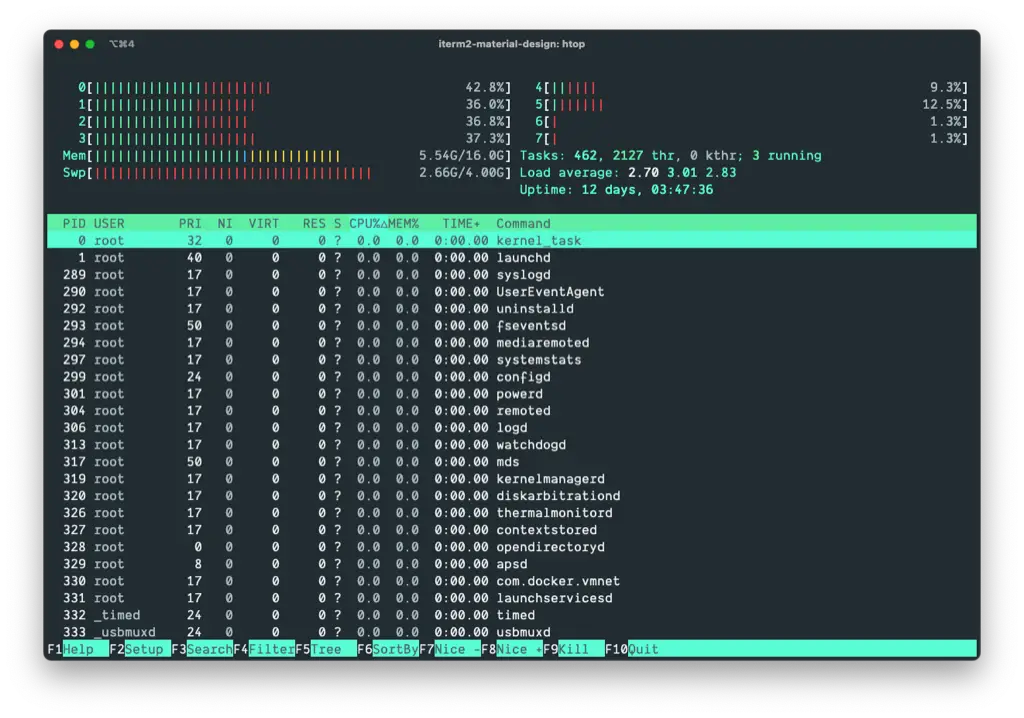
iTerm 2 Material Design
The best colorscheme for your iTerm2 terminal. Colorful, pleasant for the eyes and perfectly adjusted by the briliant designers of Google.

Utilized by Developers Worldwide
These stats are based on Githubs Insights page.
- Stars
- 2019
- Forks
- 205
- Downloads
- > 1M
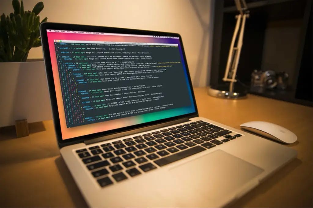
Designed for everyday use
There are a lot of color schemes out there. Most of them are pretty in the beginning, but they can be overwhelming at times. I wanted to make a color scheme that you can easily use as your daily driver as a developer on your terminal.
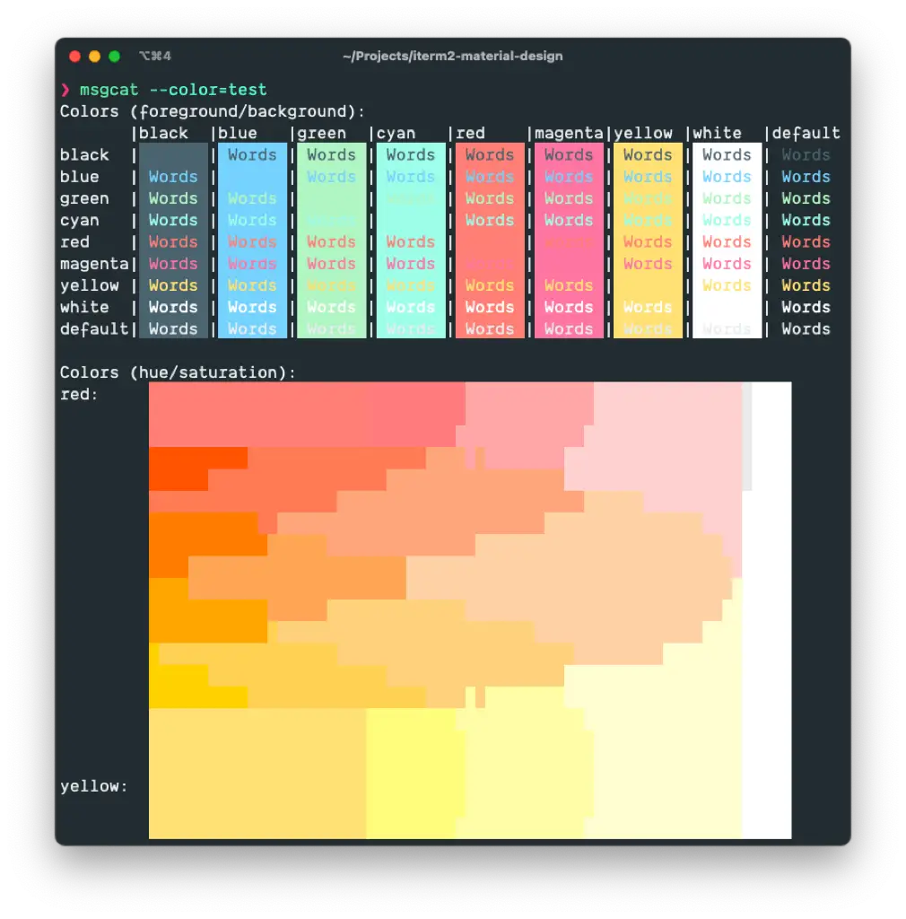
Contrast
- The colors will provide a good contrast for any terminal output.
Dark Mode
- If you're using dark mode on your machine, it will seamlessly integrate.
Accessibility
- The colors scheme will be accessible for everyone, even with red-green color vision defects.
Experts Design
- Handpicked colors for the best experience by Googles Design Team.
Installation
If you want to use iTerm2 Material Design as your terminal colors, simply follow the steps below.
1. Download
- Download the colors file to your computer.
2. Import
- Doubleclick to open with iTerm2. It will be imported automatically.
3. Select
- Select the theme in your iTerm2 Profiles tab. You can find it in Colors -> Color Presets.